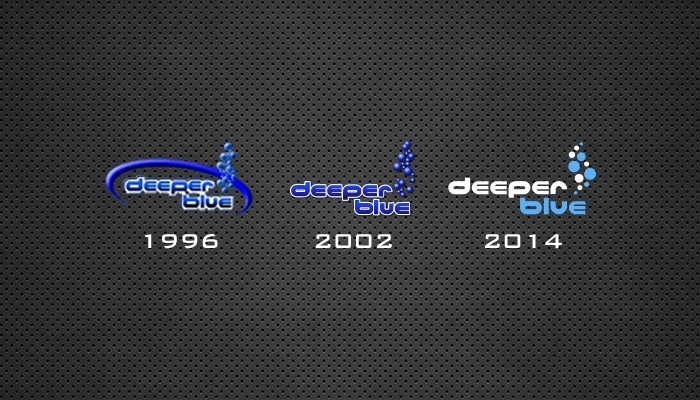
For the keen eyes amongst our readers you’ll have noticed that there had a been slight change in our branding. The first DeeperBlue.com (then DeeperBlue.net) logo was created for the original site launch in 1996. It followed the fashion at the time with swooshs and gradients – it was only meant to be a placeholder until I could afford to a new logo but it lasted for a full 6 years before time came for a refresh.
The logo you probably know best has been with us since early in 2002. It was designed by the very talented guys over at SitePoint who helped design and build our very first Content Management System (CMS). Gone was the ghastly swoosh and a freshen up of the logo generally. It has graced our screens, t-shirts, posters, videos and graphics since but as that was twelve years ago it was time for a refresh.
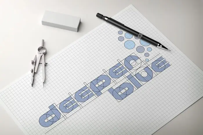
Designed by a talented Graphic Design student in Romania called Scredeck he took the brief of bring our logo a complete refresh but still keeping with the tradition of where we came from. A new flat design (all the rage right now) and simplified color scheme brings us right up to date. I brought it the attention of a number of key contributors and friends for their reaction and final tweaks before agreeing on the final design you see. I’m very pleased with the results – it’s instantly recognizable as our logo but feels fresh and new… I hope you like it too.


